Are you in the process of creating new labels for a product? Or maybe you are starting a new venture and want labels to give to people?
Whatever your need, we want to help you get the best labels – and the process starts with solid design fundamentals!
Here are the five most valuable tips to consider when designing custom labels.
1 – Ensure the text is big enough
Tiny, ineligible text ruins good designs all too often. Designers try to cram 150 words on their labels and just shrinking the text to make it fit. If you can get away with it – less is more. If you have lots of ingredients, then use a 2nd label on the back.
The problem comes because, on the computer screen, the designer can zoom in to see tiny little details, but we can’t do this once printed.
Aim for pt 7 text or more, and make sure you view the design at 100% scale on your screen to avoid any problems.
2 – Include white space
White space is a term designers use to represent the gaps between the content on a design. White space doesn’t have to be the color white.
So many designers, especially amateurs, fill every last inch of space. But don’t be tempted to do it – use white space to create wonderful designs.
Here is a brilliant example of die-cut stickers that use a lot of ‘white space’ very effectively.

3 – Get the size right
Size, in this case, is everything. Getting it right is super important.
The best, cost-efficient way to get the size spot on is to cut your label from paper and putting it where your label will end up. A few minutes spent here can avoid a lot of problems in the future.
If you are giving your decals or stickers away to people, go for a sticker about 2-3″. They are ideal handouts and work well on phones & laptops, which is right where you want them to be stuck!
4 – Design in vector
Vector artwork gets made from maths, and you create vector designs using tools such as Adobe Illustrator.
The best thing about vector artwork is when changing the design. You can scale it or change it in other ways and not lose the quality.
Bitmap artwork is the other option. It is made up of thousands of tiny pixels. If you must provide bitmap artwork, get it at a 1:1 scale with a resolution of 300DPI to guarantee it looks spot on.
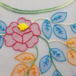
5 – Go for simple shapes
Simple shapes are ideal for labels and stickers as they make them more durable. Complicated cutlines create lots of small edges that get picked up over time and result in the sticker lifting.

Simple shapes are a must for clear stickers as they make the edge less visible. The image above shows a great example.
So we highly recommend you simplify the cutline as much as you can.
There we have it – five professional tips for creating label designs in your startup. If you have any questions, please comment below.