The intricate dance between color and emotion in art is a testament to the profound psychological effects that colors can exert on the viewer. This relationship goes beyond mere preference or aesthetics; it is rooted in psychological principles and cultural associations that artists have leveraged for centuries to evoke specific feelings and responses. The exploration of color’s power to influence emotion is not only a journey through the visual spectrum but also an investigation into the human psyche.
Color and Cultural Significance
Colors carry cultural significance that varies across societies, adding layers of meaning to an artwork. In some cultures, white symbolizes purity and peace, while in others, it is associated with mourning and loss. This cultural dimension of color psychology allows artists to communicate complex messages that resonate with specific audiences, or challenge them by subverting traditional color meanings.
The Emotional Spectrum of Color
Artists like Mark Rothko and Wassily Kandinsky have famously explored the emotional depth of color, creating works that immerse viewers in a sea of hues designed to provoke an emotional response. Rothko’s large, luminous fields of color aim to evoke profound emotional reactions, illustrating how color can be used to communicate feelings directly to the viewer’s soul, bypassing intellectual barriers.
Color Harmony and Contrast
The principles of color harmony and contrast further illustrate how artists manipulate color to influence emotion. Harmonious color schemes offer a sense of balance and serenity, while high-contrast color combinations can create dynamism and tension. These principles guide the artist’s palette, shaping the viewer’s emotional journey through the artwork.
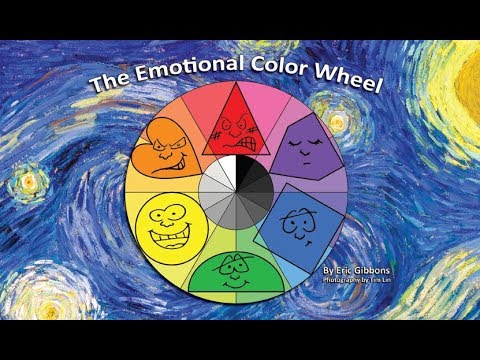
The Psychological Effects of Color Combinations
The interaction between colors can also influence the viewer’s emotional state. Complementary colors, when placed next to each other, create a vibrant look that can enhance the feeling of energy and excitement. Analogous colors, which sit near each other on the color wheel, tend to produce a more harmonious and calming effect, guiding the viewer towards a specific emotional landscape.
The Role of Light and Color
Light plays a crucial role in the perception of color, affecting how we experience hues and their emotional impact. The same color can evoke different feelings depending on its brightness, saturation, and the context in which it is viewed. Artists manipulate lighting conditions to enhance the emotional weight of colors, using shadows and highlights to create mood and atmosphere.
Reproductions and the Authenticity of Color
The challenge of reproducing the colors of masterpieces, such as Leonardo da Vinci paintings, lies in capturing the original’s emotional essence. High-quality reproductions strive to preserve the color accuracy and texture, ensuring that the viewer can experience the intended emotional impact. These reproductions serve as a bridge, allowing contemporary audiences to engage with historical works in a meaningful way, experiencing the same colors that shaped the emotions of past viewers.
In conclusion, the exploration of color in art is a deep and multifaceted journey into the heart of human emotion. Artists use color not merely as a tool for visual representation but as a language of emotion, capable of conveying complex psychological states and cultural messages. The psychology of color in art reminds us that our emotional responses to artworks are deeply personal, influenced by a myriad of factors including cultural background, personal experiences, and the psychological effects of colors themselves. Through understanding the role of color in art, we gain insights into the power of visual stimuli to affect our emotions, enriching our experience of the world around us.