A trendline is a line drawn over or under pivot highs or lows to illustrate the current price direction. In every time frame, trendlines provide a visual depiction of support and resistance. They depict price direction and speed, as well as patterns during moments of price contraction.
UP TREND LINE
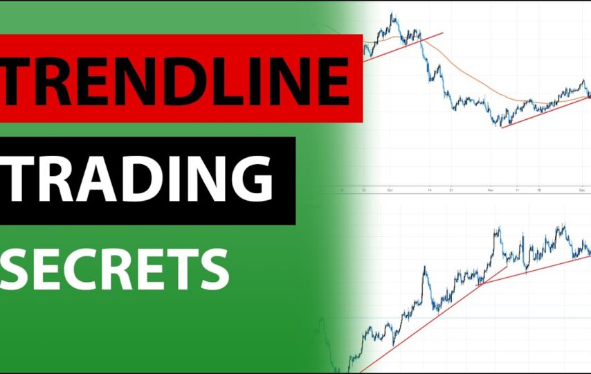
An uptrend line is produced by connecting two or more low points and has a positive slope. For the line to have a positive slope, the second low must be higher than the first. It’s worth noting that the line must be joined at least three times before it can be regarded a genuine trend line.
Uptrend lines function as support and suggest that even when the price rises, net-demand (demand minus supply) is growing. A rising price paired with increased demand is highly optimistic and indicates a strong desire on the buyers’ behalf. The uptrend is deemed robust and unbroken as long as prices continue above the trend line. A break below the uptrend line suggests that net demand has decreased, and a trend shift may be on the way
DOWN TREND LINE
A downtrend line is produced by connecting two or more high points and has a negative slope. For the line to have a negative slope, the second high must be lower than the first. It’s worth noting that the line must be joined at least three times before it can be regarded a genuine trend line.
Downtrend lines function as resistance, indicating that even as the price falls, net supply (supply less demand) is growing. A falling price paired with rising supply is extremely bearish and demonstrates the sellers’ tenacity. The downtrend is strong and unbroken as long as prices continue below the downtrend line. A break above the downtrend line suggests that net supply is declining and that a trend shift may be on the way.
Please check our article on the Dow Theory for a comprehensive discussion of trend shifts, which are not the same as trend line breaks.

SCALE SETTING
When prices are shown on a semi-log scale, high points and low points look to line up better for trend lines. This is especially true when drawing long-term trend lines or when there is a significant price shift. Most charting tools let you choose between arithmetic and semi-log scales. As you go up the y-axis, an arithmetic scale shows incremental values (5,10,15,20,25,30) equally. A $10 price change will appear the same whether it is from $10 to $20 or from $100 to $110. As the y-axis moves higher, a semi-log scale displays incremental numbers in percentage terms. A gain of 100% from $10 to $20 would appear to be considerably bigger than a gain of only 10% from $100 to $110, which would look to be much less.
VALIDATION
A trend line is drawn using two or more points. The validity of the support or resistance level represented by the trend line increases as the number of points utilized to form the trend line increases. Finding more than two points from which to create a trend line might be challenging at times. Despite the fact that trend lines are an important part of technical analysis, they cannot be drawn on every price chart. When the lows and highs do not line up, it is better not to press the matter. The usual guideline in technical analysis is that a trend line must be drawn from two points, with the third point confirming its validity.